Devlog: I'm a bad designer - Pivoting the design
Last week, I did a new version of the game’s beginning that we internally dubbed ‘redesign’, though most of the essential mechanics stayed the same. The game’s story and pacing were completely overhauled, however, leading to an entirely new experience. It also invalidated a bunch of content already implemented for the game, mainly the things already in the demo. So why make such a drastic change?
The short answer is that the game is much better for it. The long answer is, well, buckle up for a ride through the history of the project Ignis Universia: Awakening of the Erudite Empress.
We have talked about the origins of the game on several occasions, so I won’t go into much detail here, but the first game was first conceived in the oldest of the game jams, Ludum Dare, back in the pre-pandemic days of autumn 2019. The design was dictated by the realities of a jam where the participants judge dozens of games in a few weeks: short enough to be completed in a few minutes, fast to implement so there would be time for some polish, easy to get into mechanically. For that context, the design worked like a charm, and the expanded DX version of the Chosen Sister Saga has performed well enough on Steam, too, having 91% positive reviews.

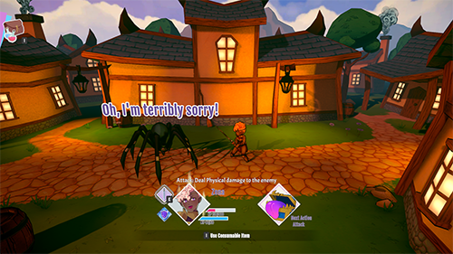
Image: Dundere will be also in a re-designed version because that's the location were everything started.
When we started talking about an oft-request sequel -- though possibly mostly because of the sequel bait joke in the end -- I had to figure out how to make that design work for a much larger game, one we could confidently charge money for. We started with one closest to the original game, only adding a more complex battle system and slightly more involved visual novel gameplay with more elaborate puzzles. We did a pitch deck out of that and sent it to some publishers but quickly realised it was not a game we’d get funding for.
In late 2020, a new design emerged as we started talking about the possibility of a Kickstarter. We needed something grander to entice fans of the genre and decided on a full-fledged JRPG. The art would be 3D, instead of the 2D pixels of the jam game to stand apart from the cornucopia of RPGMaker games and because high-quality pixel art is very resource-intensive to produce, especially if multiple animated characters are needed. This changed a lot and also introduced the first version of the game’s story. In this game, the Null Brother had disappeared, and the Sisters would reunite to find him. The theme was rekindling old friendships. The production choices dictated the story: I didn’t want to show the Null Brother, so the only way to have a third person game was to get rid of the original main character altogether.
We kept from the first design the battle system, which was meant for a game closely resembling the first one, a visual novel with some JRPG elements, and kept the simplicity of only having two choices per turn for each character. Choosing the characters’ turn order in battle also fit the flow of a 2D, primarily text-based game well. However, for a 3D JRPG, it turned out to be too limited.
As we started working on the game, it slowly became obvious that our vision had been a bit too optimistic. Even with the amount we could realistically raise from Kickstarter, a full -- if short for the genre -- JRPG would be too expensive to produce. That culminated in June 2021 into the second design pivot, where we decided to backtrack a bit and reintroduced the visual novel storytelling, also bringing back the Null Brother. At this point, the first three levels that ultimately constituted the demo were mostly finished, and the start of the Kickstarter campaign was only a few weeks away, so the chances needed had to be small. The level in the demo was originally meant to be from the middle of the game, but in the new story, it was switched to be the beginning. A short dialogue was added to the beginning to replace what was originally meant to be a full level with NPCs and cutscenes. The new design was much more humble and easier to actually realise with the budget we had planned. It really felt like we were going in the right direction.
And we were, kinda.
The Kickstarter came and went. Coming in, we had known that we had enough to produce a version of the game even if the crowdfunding failed, but now we had to plan very carefully to not overshoot the budget. There was also plenty of feedback from the demo and come October and the Steam Next Fest we had a more polished version of the demo too. After playing it for the streams and reading the comments we got from publishers it dawned on us that the current design isn't cutting it either. There was positive feedback too, and the fundamentals seemed to be solid enough, but the game just didn’t feel right. It was time for a new pivot.
The newest redesign takes the game even further back to its roots. There’s more visual novel dialogue, the tone is considerably lighter, and you start the same way as in the Chosen Sisters Saga: choosing locations on a map. The dungeons are still there, but instead of a few larger areas, we now have several smaller ones, each focused around a single puzzle with only a handful of battles.
The combat has changed too, now the turn order screen is gone, as it was detrimental to the flow of the game and the battles are, like in the original, puzzles to be solved. Now they too feel a bit less frustrating.
There’s still a ton of things that remain undetermined for the new redesign, including the overall story. I wrote the new narrative as I went, not thinking about the grander story arc, much in the same way I did in Ludum Dare. The battles will need more thinking too, as we still need to make the system to support a game several hours long, but I have plenty of ideas for that now.
The game is better for these changes now, but I also feel like a very bad game designer, as it has taken a year and many choices that were, in retrospect, very obvious to reach the point we are in now. As a small company, that is a lot of time we don’t have. The other frustrating thing is that I had to look at my own design and learn what made it work so well, which is a set of fundamentals I should know by heart.
- Arzi
Get Ignis Universia: Spa of Destiny
Ignis Universia: Spa of Destiny
Demonlords, cookies and cute fluffy animals! A light-hearted and 100% turn-based RPG adventure
| Status | In development |
| Authors | Arto Koistinen, RandomPotion |
| Genre | Role Playing, Visual Novel |
| Tags | 3D, Fantasy, Female Protagonist, JRPG, Short, Singleplayer, Story Rich, Unity |
| Languages | English |
More posts
- Ignis Universia: Spa of Destiny Demo!Oct 23, 2024
- The Ignis Universia Sequel Is Now Known as Spa of Destiny!Aug 27, 2024
- We did it! Ignis Universia reached it's goal on Kickstarter!Mar 03, 2022
- Last Kickstarter days are here - Check out our Special Backer FOMO Package!Feb 23, 2022
- Ignis Universia is now live on Kickstarter - check our campaign page and play th...Feb 04, 2022
- Yay! Kickstarter starts in February!Jan 21, 2022
- It's coming back stronger! Ignis Universia is coming back to Kickstarter!Dec 08, 2021
- Devlog: New environment is under development!Oct 15, 2021

Comments
Log in with itch.io to leave a comment.
Sorry, what I was meant to say is: "You dared not to give a harem for my boy Zero??? Unbelievable."
One of the most common and perhaps "cliche" plots of any media, is the idea of overcoming impossible odds when they are stuck against you, learning from mistakes and improvements, and the power of friendship with a side of redemption. I think there is a reason why they are still relevant to this day.